November ’23 city election by the numbers
About 30% of registered voters cast ballots for mayor, city councilors, and half the school committee in the 2023 Quincy City election.
Below, Quincy Votes! breaks down how many people voted and how they voted, thanks to voting data from the city clerk, and which demographic groups turned out in higher numbers, thanks to US Census data mapped by board member David Shiga. A Quincy Votes! voter survey also reveals issues that made voting difficult for some residents. Scroll down for more information or click here for a slideshow of all the analyses.
How many people voted?
Less than a third of eligible voters turned out in the 2023 city election.
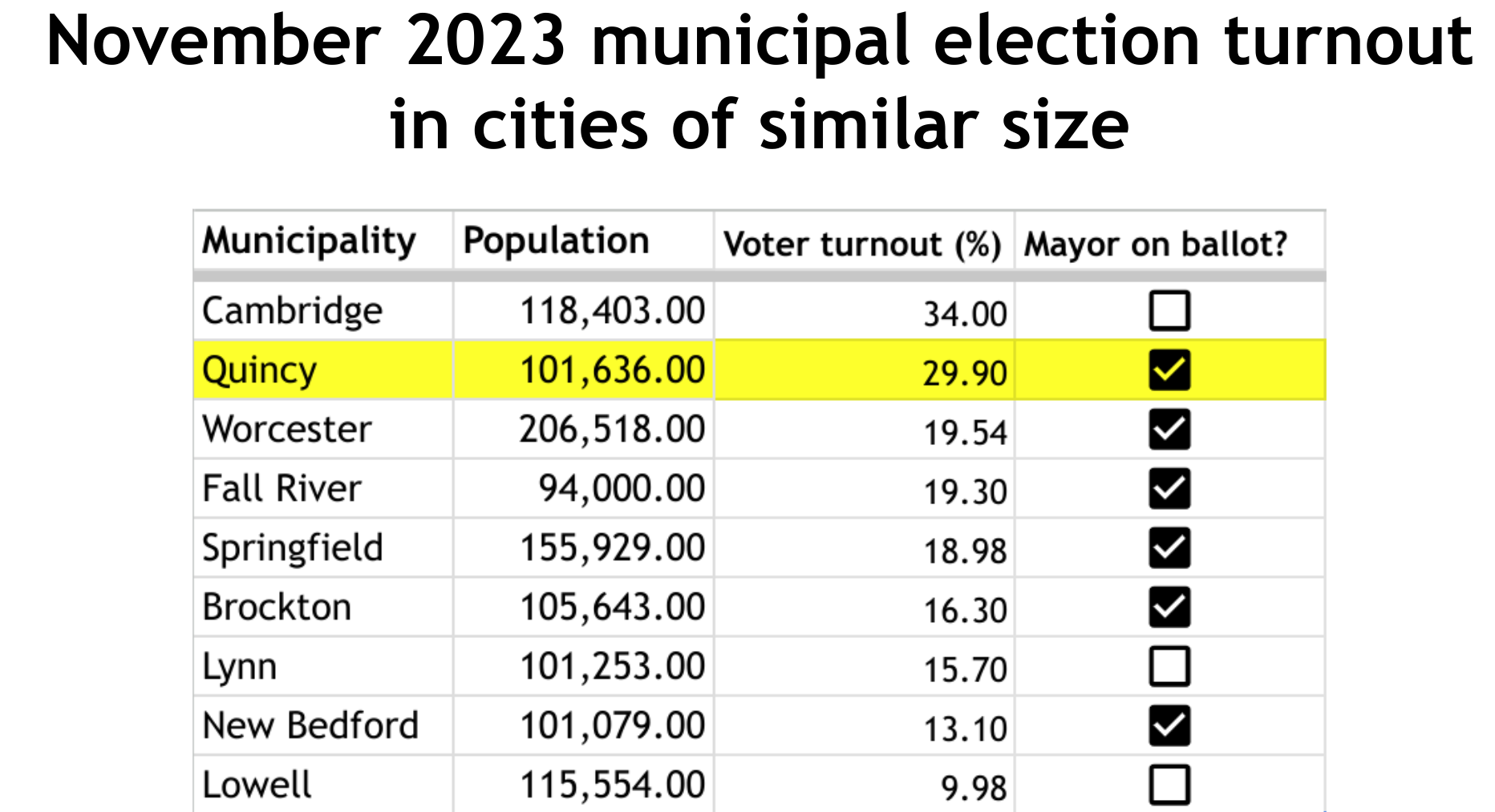
Despite the fact that a minority of eligible voters cast ballots, Quincy’s voter turnout compared relatively favorably with cities of similar size that answered voter turnout questions from Quincy Votes!
How did people cast their votes?
Most people chose to vote in person — either on Election Day or during early voting.
Which demographic groups voted in higher — or lower — numbers?
For this analysis, QV! board member David Shiga mapped voter turnout data by precinct and then made maps of 2020 demographic data from the US Census. Comparing the maps shows which demographic groups voted in higher numbers.
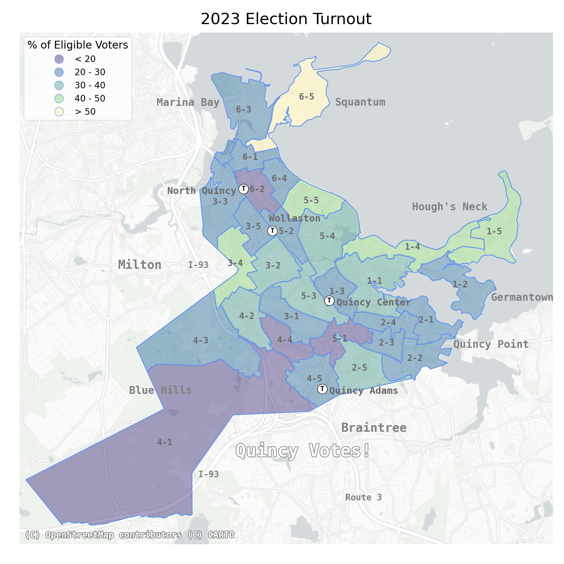
The map above shows voter turnout by precinct (the number before the hyphen is the ward; the number after the hyphen is the precinct). Lower voter turnout rates are shown in darker colors.
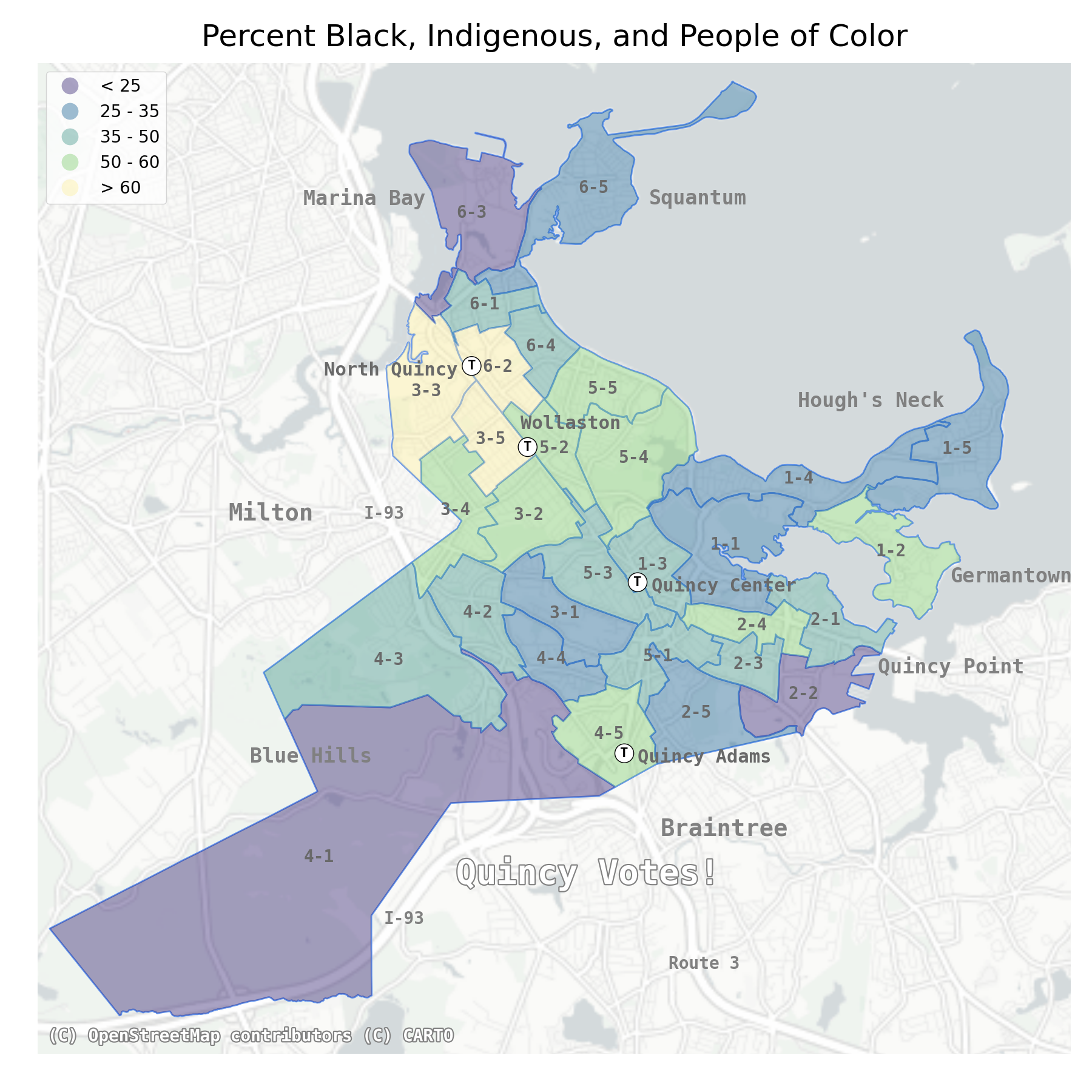
The map on the left above shows 2020 US census data only; the map on the right above voting data only. Lower percentages in both are marked in darker colors.
You can see that the precinct with the highest voter turnout, 6-5, has a low percentage of people of color, and the three precincts with the highest percentage of people of color (3-3, 3-5, and 6-2) turned out relatively few voters.
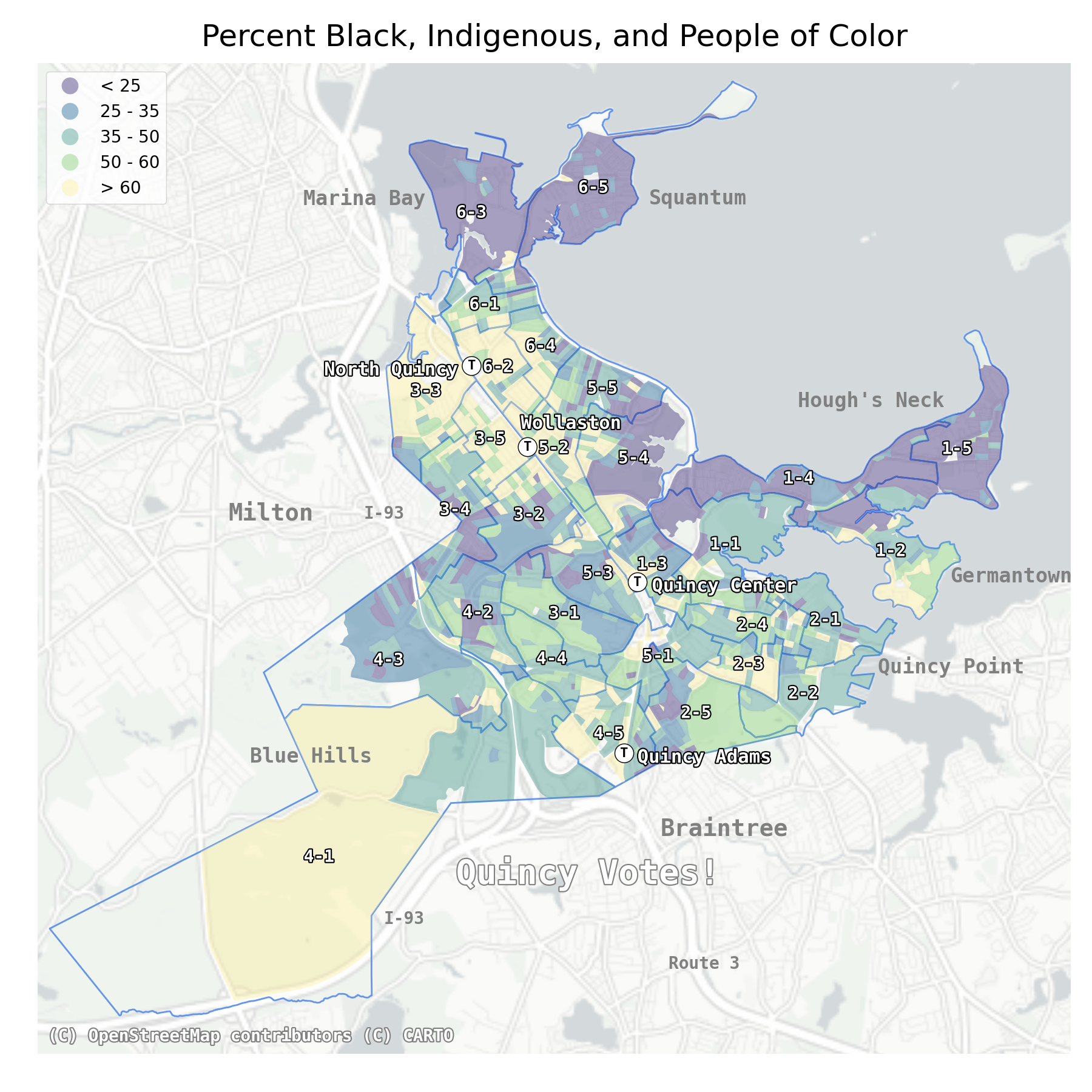
The map on the left above shows US census data only at a neighborhood level (the map just above showed the data averaged over each precinct); the map on the right above voting data only. Lower percentages in both are marked in darker colors.
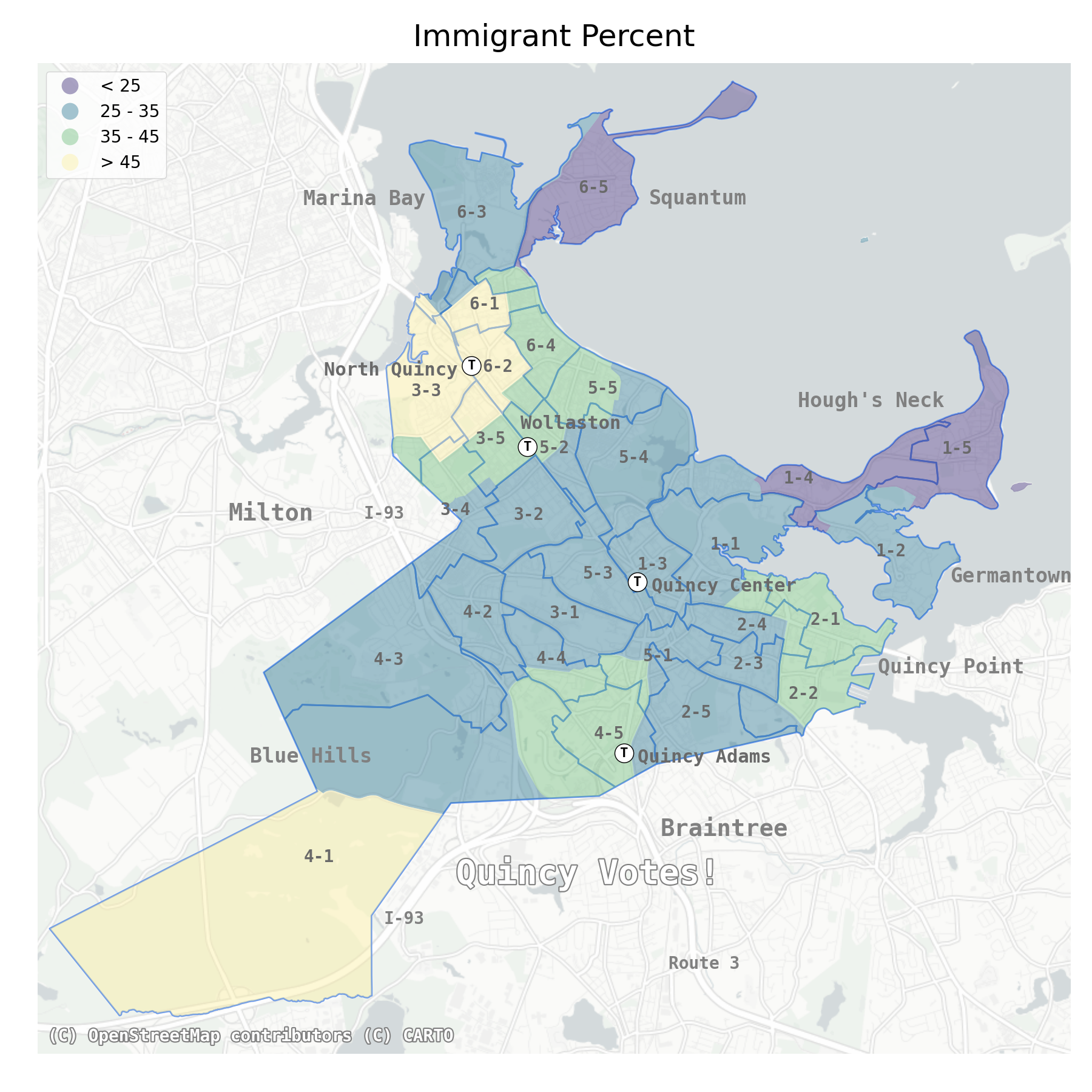
The map on the left above shows US census data only; the map on the right above voting data only. Lower percentages in both are marked in darker colors.
These maps show low voter turnout rates in precincts with more immigrants (3-3; 6-2; 6-1), and high voter turnout rates in precincts with fewer immigrants (6-5; 1-5; 1-4).
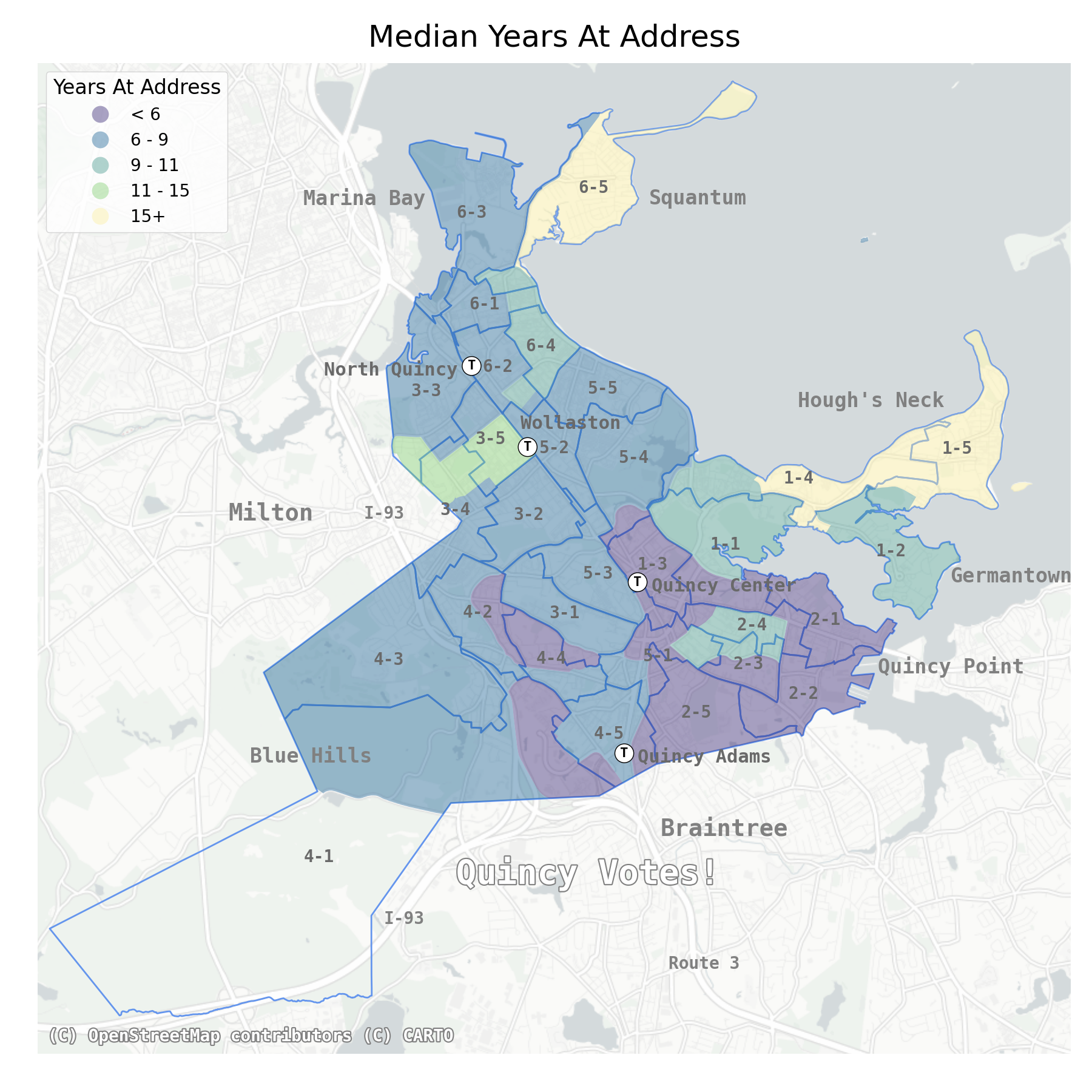
The map on the left above shows US census data only; the map on the right above voting data only. Lower percentages in both are marked in darker colors.
Here you can see that some of the areas where people have lived at the same address the longest, on average, also have the highest voter turnout rates (6-5; 1-5; 1-4). But some precincts with high voter turnout rates have residents who have not been at their current address for very long (e.g. 2-5; 5-5).
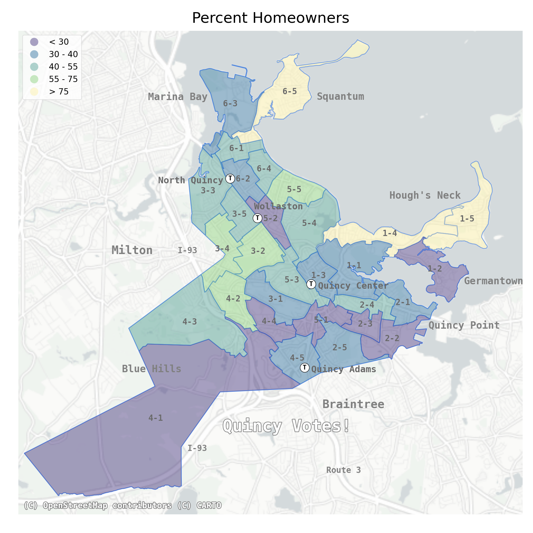
The map on the left above shows US census data only; the map on the right above voting data only. Lower percentages in both are marked in darker colors.
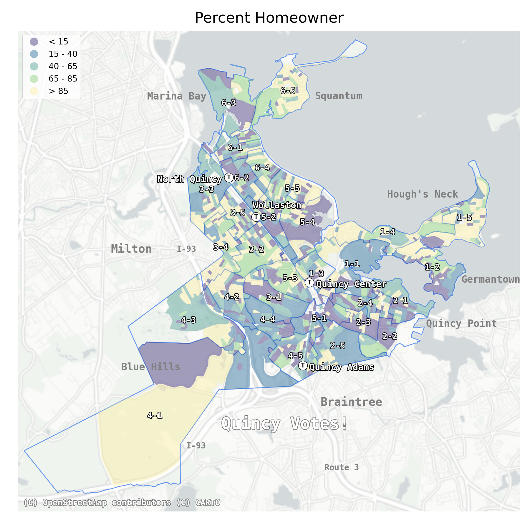
Higher rates of homeownership correlate with higher voter turnout rates.
The map on the left above shows US census data only at a neighborhood level (the map just above it showed the data averaged over each precinct); the map on the right above voting data only. Lower percentages in both are marked in darker colors.
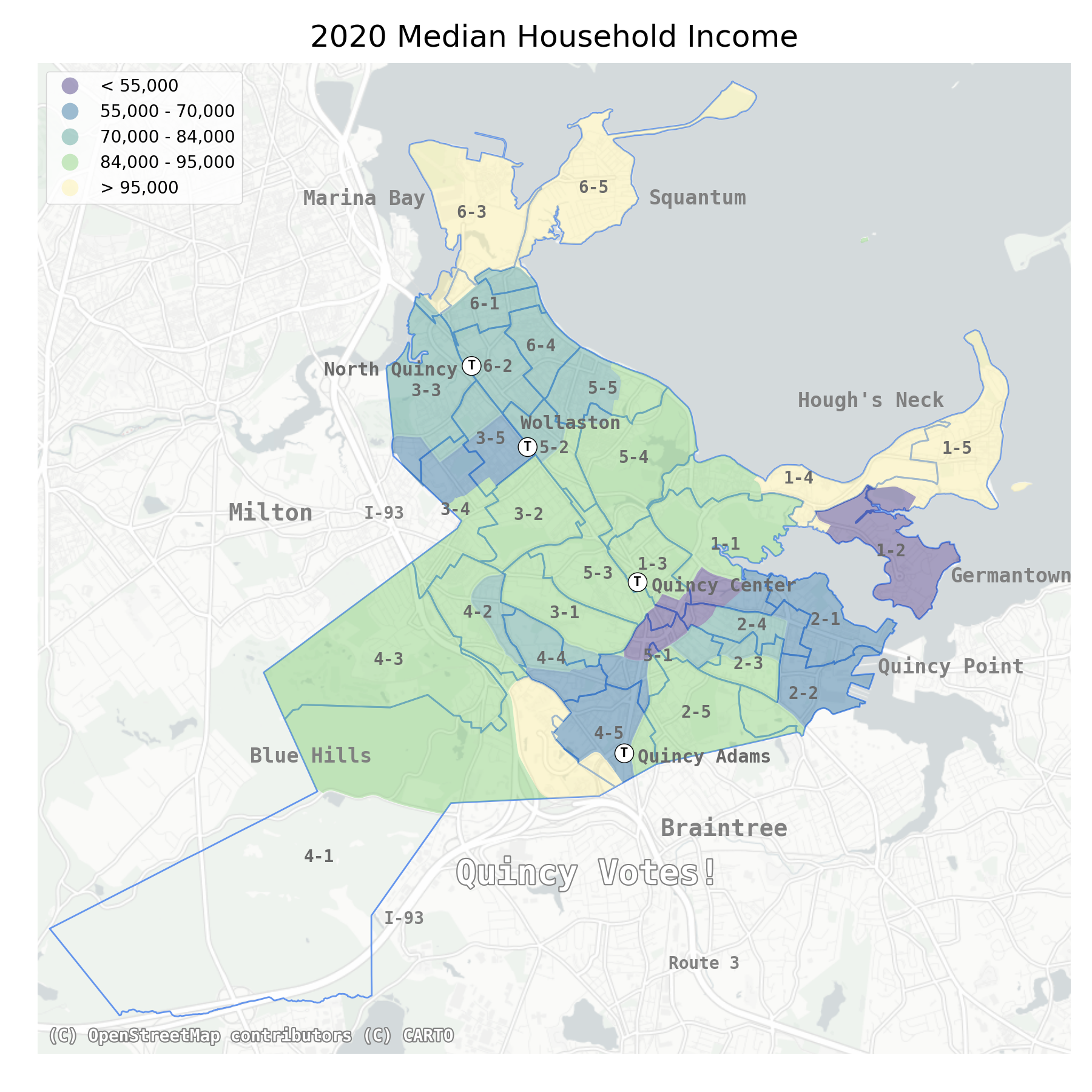
The map on the left above shows US census data only; the map on the right voting data only. Lower percentages in both are marked in darker colors.
Some of the precincts with the highest average incomes had some of the highest voter turnout rates (6-5; 1-4; 1-5). But not all — the high-income Marina Bay precinct (6-3), for example, had a low voter turnout rate.
What issues did people have voting?
Quincy Votes! created a bilingual survey to find out more about people’s experiences in the 2023 city election. 201 people filled out the survey, and the results will help us focus our efforts in future elections.


